Tu/Th 5:00–6:20 | section FIVE | intro to graphic design | Renée Stevens

Archive for the ‘logos’ Category

old logos to new

here are a set of logos that have been changed recently and in the past from fast food chains. I think all the improvement are for the better. Also, with the improvement in technology the quality of the logos are much better. The actual way it looks is much more sophisticated and is easier on the eyes. I also was browsing and found a set of companies that changed their logos and never even knew some of the old ones existed! So I thought I would throw these in there too.

John Sherffius Political Cartoon, 03/29/2011

John Sherffius Political Cartoon, 03/29/2011.


I found this really hilarious. 


Graphics Current Events


Coinstar changed its logo this week from a script font with a star to this sans serif font with circles. I think the new logo is much better than the old one for several reasons. When you use a coinstar machine the point is to simplify all your loose change into bills. The sans serif font is much simpler which compliments the idea of a coinstar machine much better than the script font. I also think the circle part of the new logo relates much more to the purpose of coinstar machines because it looks like coins. Overall I think the new logo is much better.

LOGO

This slideshow requires JavaScript.


Enjoy.

FINAL LOGO

This slideshow requires JavaScript.


Long journey, but done!
(more…)

Final Logo

Logo Roughs

definitely worthy of the work in progress tag… I can’t figure out how to work the templates and I’m still trying to fix the edges on the black card.  But I’ve settled on the logo.

Logo Ideas

Business Card

back of envelope (could bold the back as well without the black flap)

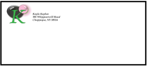
front of envelope

logos

This slideshow requires JavaScript.

Logo Project- Helen Rubinstein

Above is my logo just by itself and my business card, the back of the business card is just the same solid green as the logo.